

Solving for Scale: UX Improvements in B2B Marine Lubricants Space
Revamping a B2B Ordering Platform
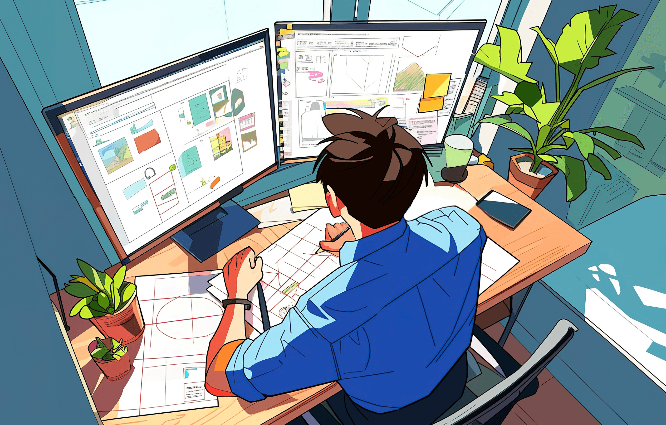
Project Overview
This case study captures the redesign journey of a B2B web platform used for bulk ordering of marine lubricants.
The platform served global customers, delivery agents, and sales representatives involved in managing complex logistics at sea and port.
The project followed an Agile UX process.
Due to NDA, the client name has been omitted.
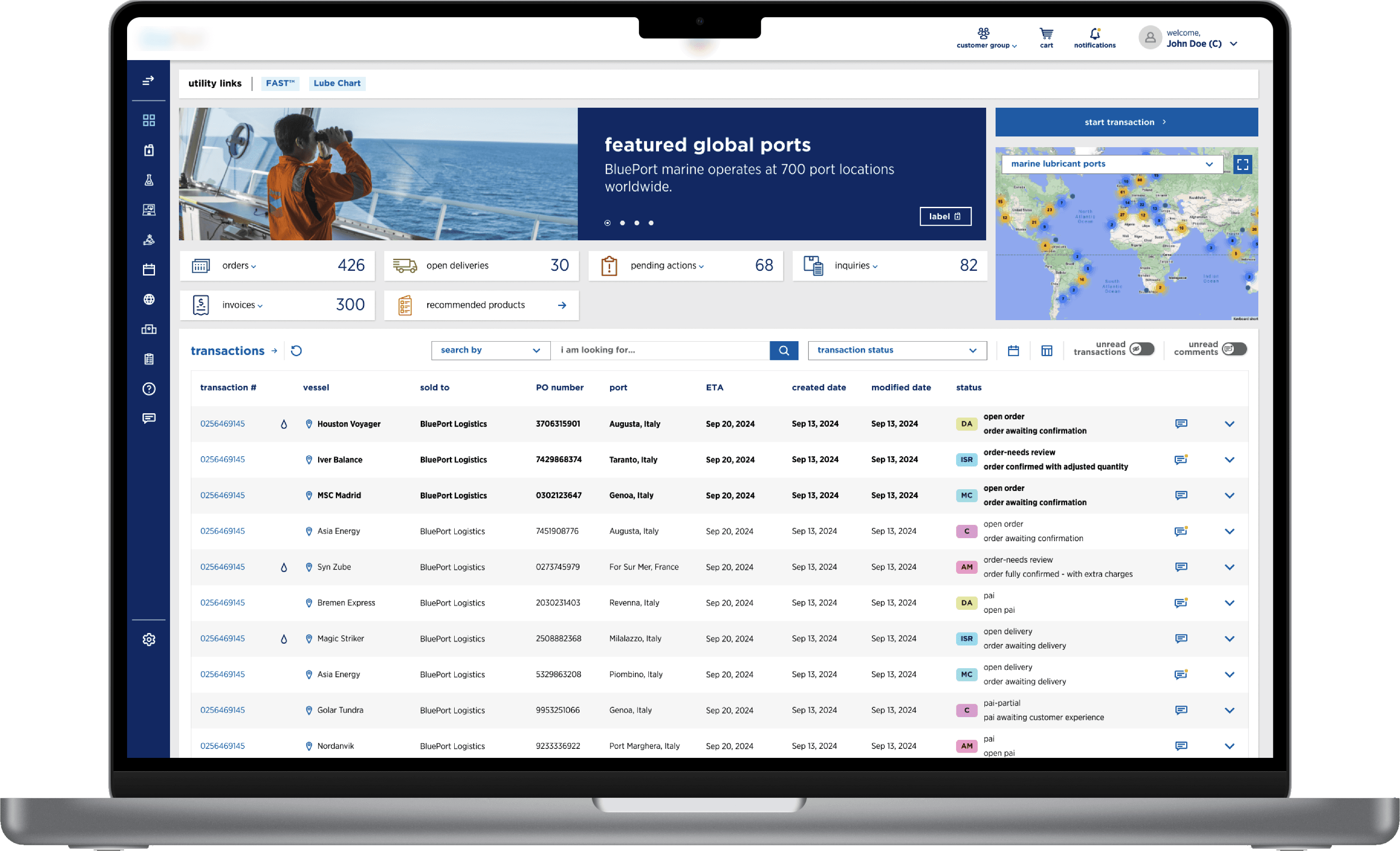
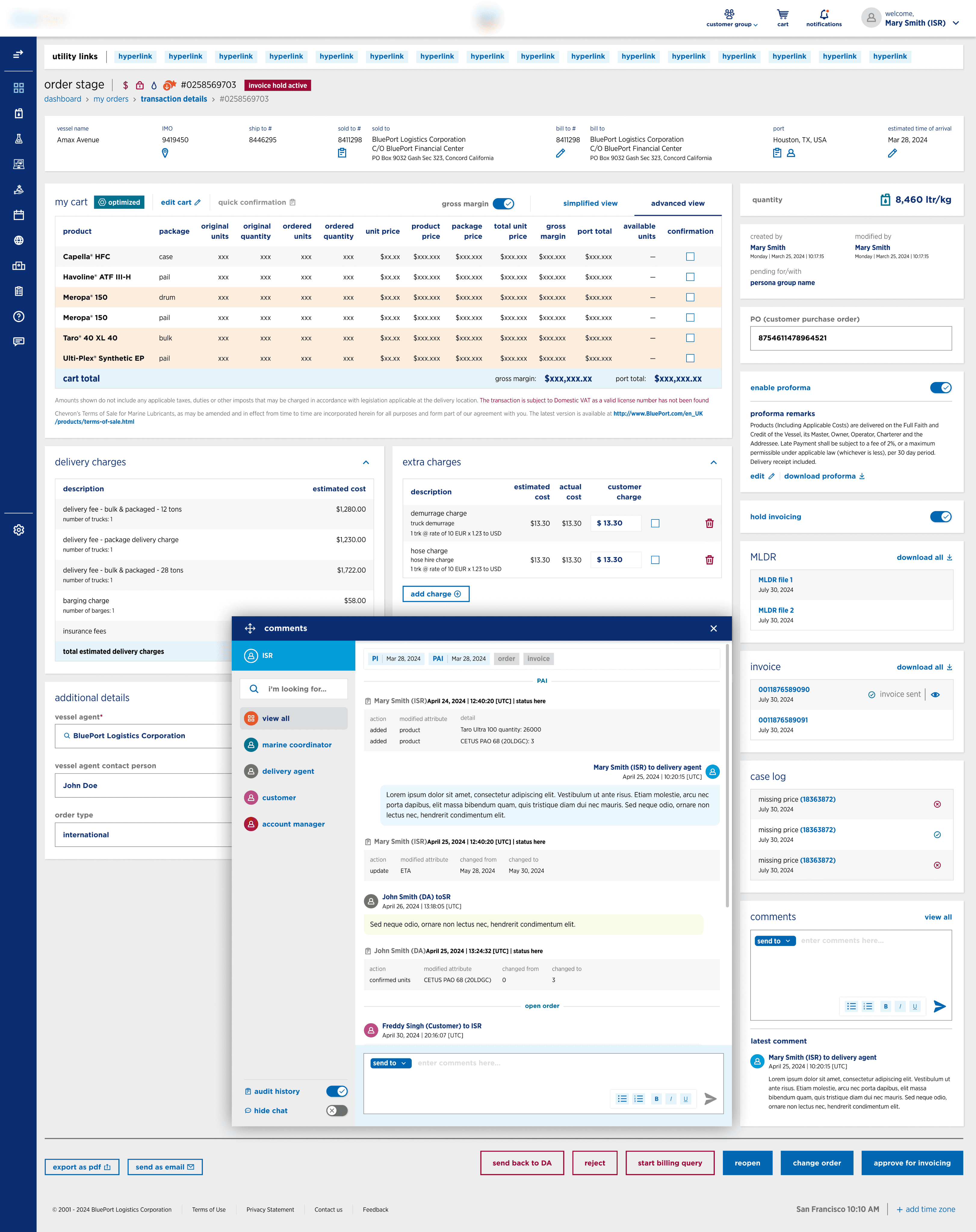
Existing UI – Prior to UX Revamp
Understanding the
Business Complexity
The marine lubricants industry presents a uniquely layered challenge. A single vessel consists of multiple equipment systems, and each piece of equipment may include several parts. These parts demand specific lubricants or oils, often in different volumes.
Adding to the complexity, the same product might be available in different package types—Bulk, IBC, Drum, Pail, or Case—and shipped through various delivery modes including trucks, barges, tankers, or smaller vehicles depending on regional infrastructure.
Orders are typically placed by Customers or Customer Sales Representatives (CSRs). Once submitted, the request is routed through Account Managers, Marine Coordinators and fulfilled by regional Delivery Agents. Most deliveries are made directly to ports or vessels, meaning timing and availability are critical.
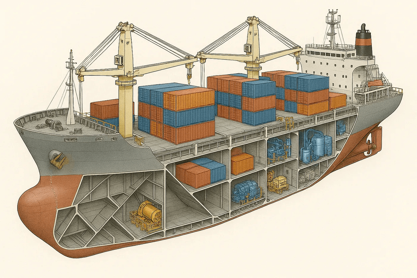
Illustration to show the complexity of Vessel Equipment and Parts
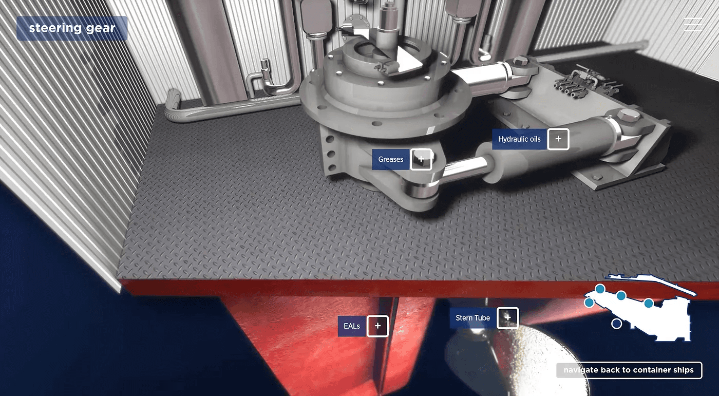
Illustration of Equipment, Parts and Lubricants/Oils used for the same
My Role
I was the sole UX designer responsible for end-to-end design activities. My work involved close collaboration with the Program Manager and Product Owner to understand business workflows and requirements.
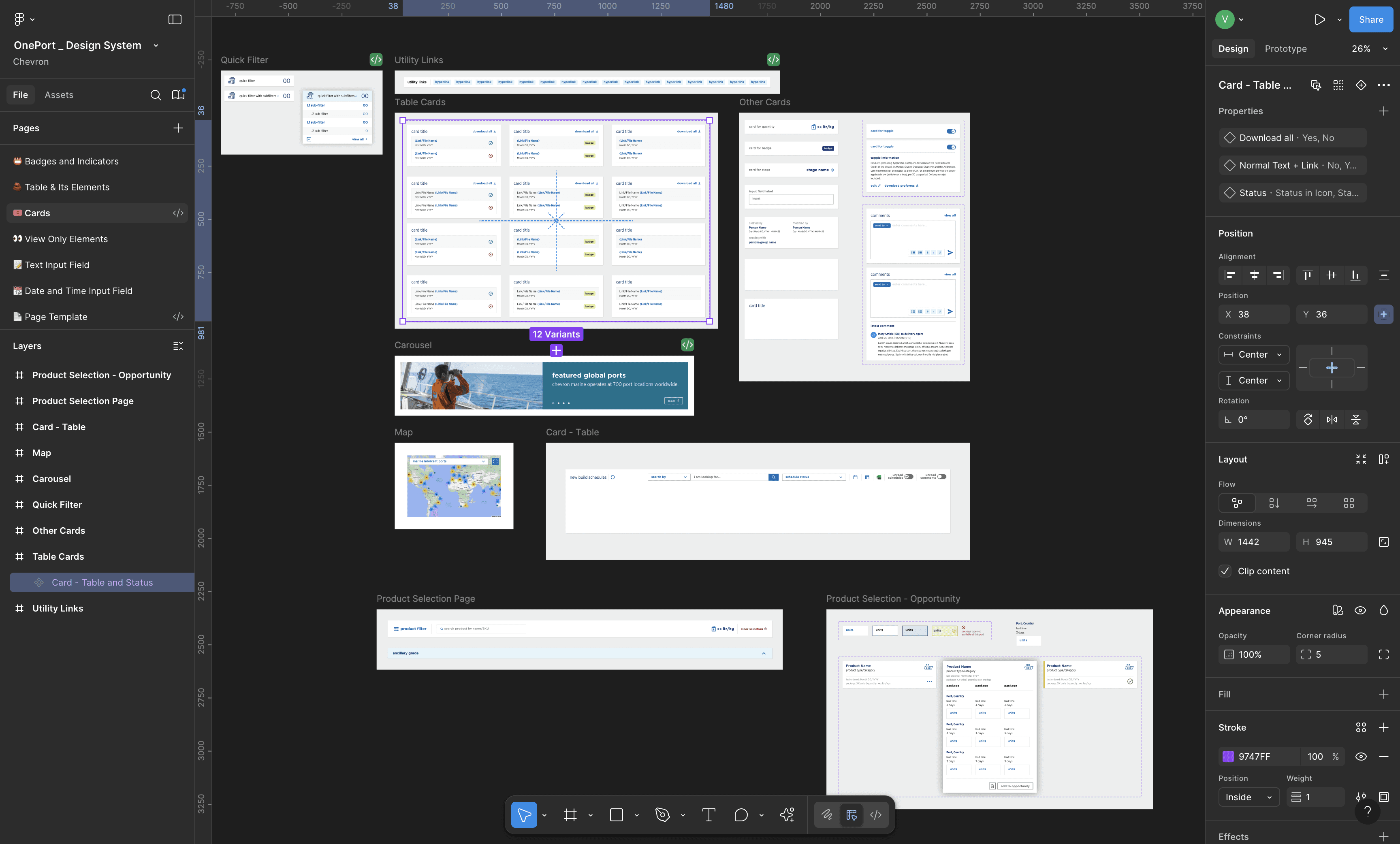
I led the design of task flows, wireframes, high-fidelity visuals, and the extension of the design system.
Tools used throughout the project included Figma, FigJam, and PowerPoint for stakeholder reviews and handoffs.
User Roles and Goals
Customers
placing direct orders and managing fleets.
Customer Sales
Representatives
(CSRs)
placing direct orders and managing fleets.
Account
Managers
supervising account health (bridge between Customers and CSRs)
Marine
Coordinators
supervising delivery agents
Each role had a different priority, but the old interface treated them all alike. This generic experience created friction, inefficiencies, and increased turnaround time.
Customers and Customer Sales Representatives can place order; Account Managers and Marine Coordinators can view the transactions and talk to CSRs through the portal.
The Problem Landscape
Choice Overload
Trying to select the right product felt like navigating a maze.
With multiple buttons in various colors scattered across the screen, prioritizing actions was a mental load for the users.
Missing Breadcrumbs
It was easy to get lost. Without breadcrumbs, users had no clear sense of where they were or how they got there
Disjointed Context
Switching between pages just to recall information from previous page/selections became a frustrating ritual.
Key details weren’t carried forward, forcing users to rely on memory or back-and-forth clicks.
Buried
Packaging Info
Users had to dig deep. Packaging availability was hidden behind multiple clicks, delaying decisions and creating friction for high-volume orders.
Popup Fatigue
Actions triggered blocking popups that locked the screen. Users couldn’t reference background data, disrupting the flow and making them feel boxed in.
Visual Clutter
The UI was noisy—too many CTAs, inconsistent spacing, and competing focal points. Users couldn’t quickly locate what mattered most, especially under time pressure.
Framing the Redesign Challenge
1
How might we streamline complex ordering workflows across vessel, port, and product selection to reduce user effort and error?
2
How might we make packaging availability instantly visible to eliminate unnecessary clicks and decisions?
3
How can we reduce cognitive overload by simplifying action hierarchies and removing visual clutter?
4
How can we replace disruptive popups with flexible popovers that maintain background visibility and flow?
5
How might we speed up decision-making with status indicators, reusable UI components, and consistent interactions?
6
How might we introduce breadcrumb-based navigation to keep users anchored and informed at every step?
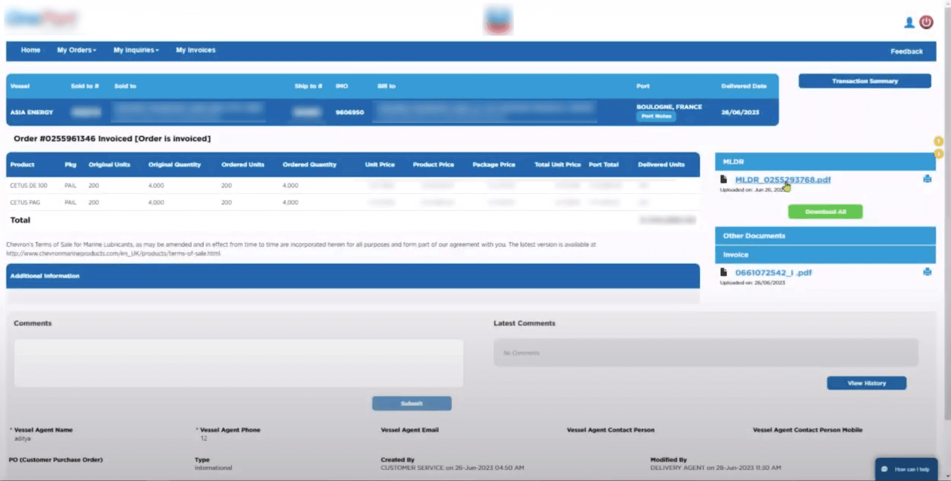
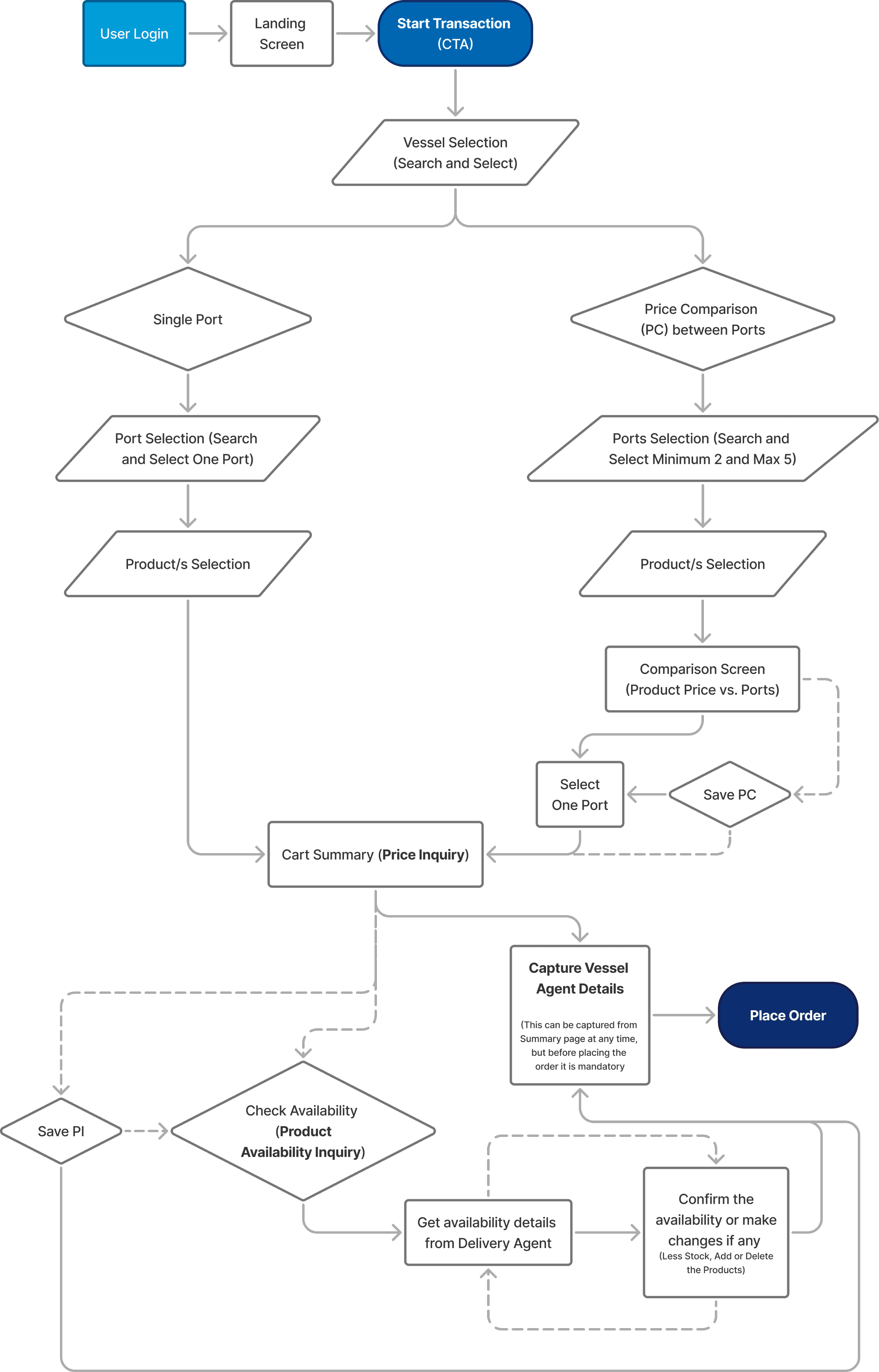
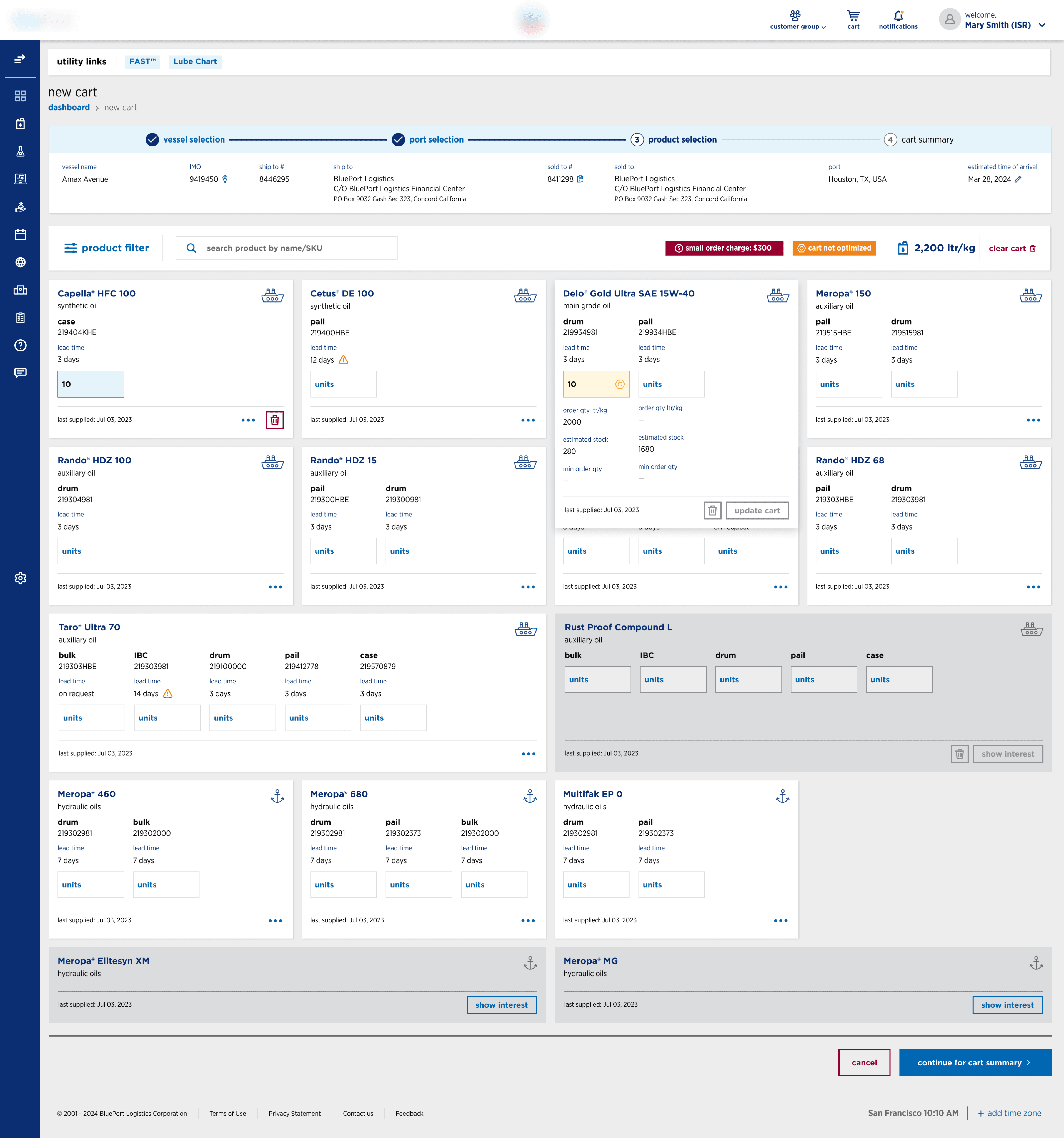
The Ordering Experience
The redesigned flow began with selecting a vessel from the user’s fleet. Next, a delivery port was chosen. The system automatically pulled product recommendations from a Lube Chart—a separate internal system storing part-equipment-product mapping for that vessel.
Users could then enter required quantities and choose from three pre-order options:
Price Comparison: Enabled users to compare up to five ports and select the most cost-effective delivery.
Price Inquiry: A non-committal quote with a unique ID, allowing users to return later.
Product Availability Inquiry: A manual check handled by a Delivery Agent, ensuring stock readiness.
Alternatively, users could skip these steps and directly place an order from Price Inquiry. In such cases, delivery Agents would later validate availability and confirm or escalate shortfalls.
Design Solutions in Action
📊
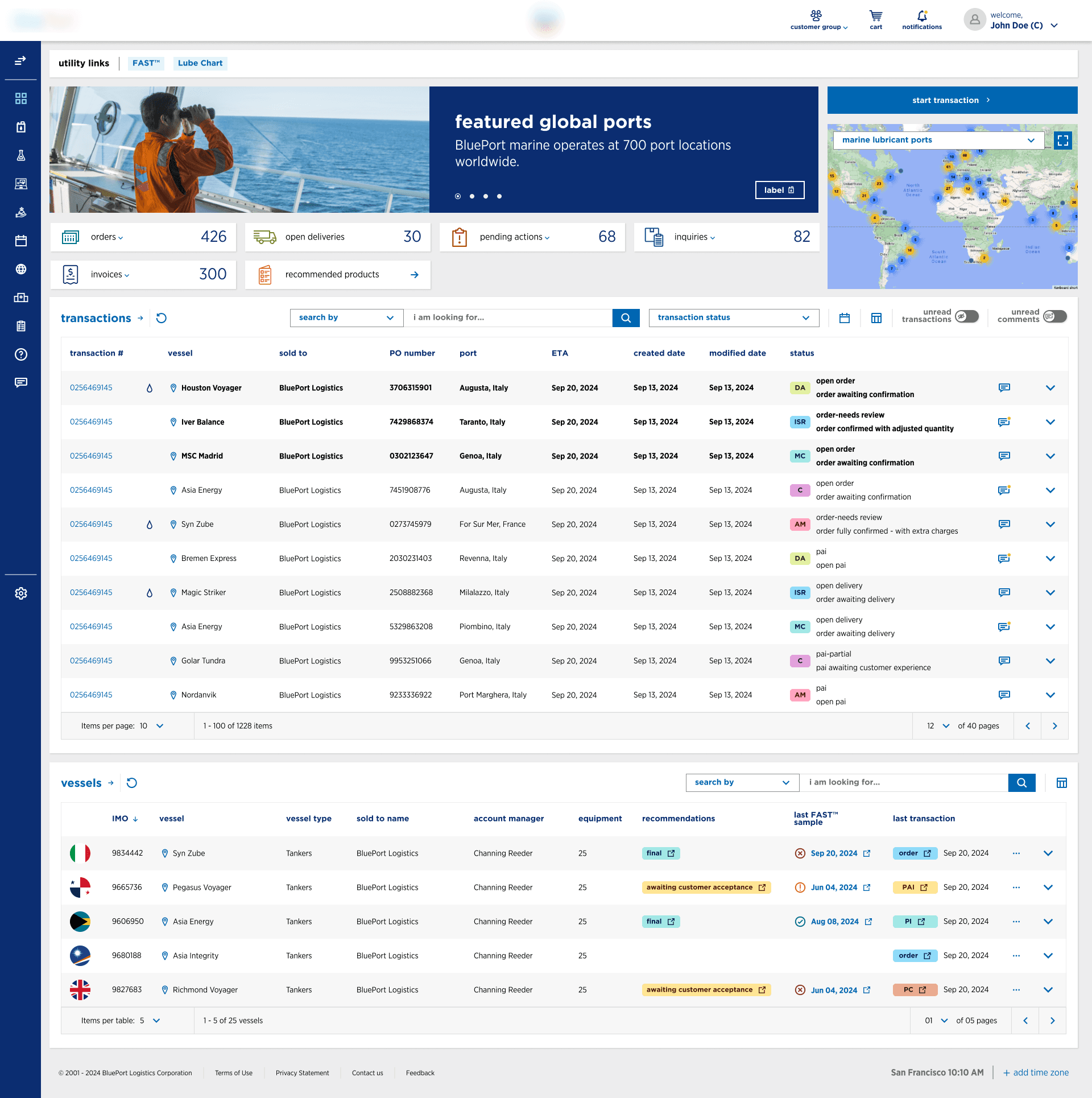
Quick Glance
The redesigned dashboard surfaced key metrics right away—open orders, pending deliveries, and active inquiries—all structured cleanly for at-a-glance clarity.
🔁
Context Carried
No more back-and-forth. Vessel and port selections now persisted across screens, giving users a continuous, grounded experience.
🧭
Clear Navigation
Breadcrumbs provided much-needed orientation. Users always knew where they were and how to retrace their steps with ease.
📦
Packaging Preview
Product cards now displayed all available package types upfront. Users could make faster decisions without the guesswork or extra clicks.
🪟
Popover Freedom
Movable popovers replaced blocking modals. Users could interact with forms or filters while still referencing the information behind them.
🟢
Status at a Glance
Color-coded badges and status indicators gave users quick insight into order states without scanning rows of text.
🎯
CTA Focus
Buttons were reduced and recognized by user role. No more “button soup”—just the right actions, in the right place, at right time.
Key Experience Gains
🧭
Better Navigation Continuity
Breadcrumbs and consistent information retention created a smoother experience, especially in multi-step flows.
💡
Improved Order Visibility
Stakeholders appreciated clearer product/packaging availability early in the flow—helping reduce back-and-forth and improving decision-making.
📉
Reduced Confusion in Workflows
Streamlined actions and information hierarchy led to faster onboarding for new users and fewer clarification emails from CSRs.
🎛️
Streamlined Role-Based UI
Different user types—Customers, CSRs, Account Managers, and Marine Coordinators—were shown only the relevant data for their responsibilities.
🎯
Faster Turnaround for Orders
Product Owner reported improved efficiency in placing and reviewing orders thanks to surfacing packaging, pricing, and availability in one view.
📋
Simplified Action Hierarchy
Cognitive load was reduced by prioritizing CTAs and removing visual clutter across screens.
🪟
Non-blocking Popovers
Movable popovers replaced full-page popups, allowing users to interact with overlays while referencing background data.
💬
Positive Stakeholder Feedback
Product Owner and Program Manager acknowledged improved workflows, layout clarity, and availability transparency.
Enterprise UX:
Lessons Learned
Designing without direct access to end-users meant the success of the product relied heavily on stakeholder alignment and deep business immersion. Mapping real-world operational workflows into intuitive UI reinforced my belief in user-centric systems thinking—especially in high-stakes, enterprise environments.
This project also highlighted the importance of scalable design systems and contextual UI flexibility for complex B2B platforms.
Opportunities
Beyond My Tenure
Although I’ve transitioned out of the project, there remain valuable opportunities to take the experience even further.
User testing would be the most impactful next step—validating assumptions, uncovering role-specific usability friction, and gathering behavioral insights that weren’t accessible during the stakeholder-driven design phase.
Testing with real Customers, CSRs, Account Managers, and Marine Coordinators could lead to more nuanced improvements.
There’s also scope to explore role-based dashboard personalization, enabling users to focus on their most frequent actions without distractions. Finally, extending the design system across related internal tools would help unify the broader ecosystem and reduce design-debt over time.
If continued, these steps would deepen the platform’s impact—strengthening usability, decision-making, and operational efficiency.

Let’s Design Something Meaningful
Say Hello

Vishnuprasad Jahagirdar
© 2025 Vishnuprasad Jahagirdar
All rights reserved